Photoshop
Textures and overlays
A texture or overlay in Photoshop is an ordinary layer sitting on top of the picture with its blend mode changed: bring it in with File > Place Embedded, then set Multiply, Screen, Overlay, Soft Light or Luminosity in the dropdown at the top left of the Layers panel and pull the opacity back to somewhere between 15% and 40%. Verdict: CURRENT. The mechanism has not changed and nothing replaced it. The treatment is a separate matter: the full frame grunge, coffee ring, torn paper and heavy vignette stack of roughly 2006 to 2012 dates a picture on sight, and the second section below says exactly what gives it away.
CURRENT
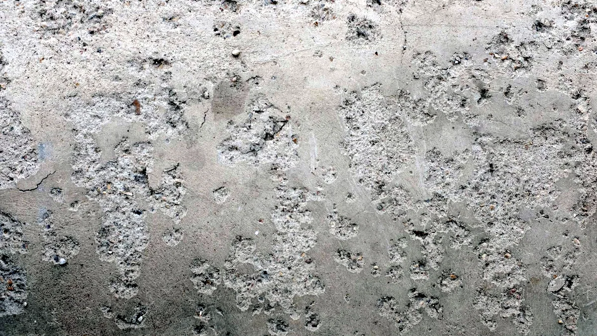
Placing a texture, and the 5 blend modes that do the work
Placing a texture with File > Place Embedded brings it in as a Smart Object, which matters because you will rescale it 3 or 4 times before you are happy and a Smart Object survives that without softening. Once it is in, the blend mode decides what part of it you keep.
| Mode | What survives | Use it for |
|---|---|---|
Multiply | the dark marks; white disappears | ink, pencil, dirt, stains, scanned paper, a shadow you are adding |
Screen | the light marks; black disappears | light leaks, flares, dust motes, bokeh, smoke and sparks shot against black |
Overlay | contrast in both directions; 50% grey disappears | strong surface texture where you want the punch, usually too much at full opacity |
Soft Light | the same, gentler | paper grain, canvas, plaster, the default first try |
Luminosity | the texture's tone only, none of its colour | a yellowed paper scan that would otherwise tint the whole picture |
The maths behind each of those is on the blend modes page, and one line of it is worth carrying here: Multiply cannot darken pure black and Screen cannot brighten pure white, so a dark texture on Screen or a bright one on Multiply will look broken when it is only being obedient. Flip the mode before you assume the file is wrong.
Why most overlays read as a filter, and the mask that fixes it
Most overlays read as a filter because they are applied at uniform strength across the whole frame, and uniformity is the one thing that never happens in the physical world. Real dirt collects in corners and crevices. A real light leak enters past one edge of the film gate, so it comes from one side and fades. Real paper grain is even, but the ink density sitting on it is not. An overlay that ignores the picture's own light is a sheet laid over the picture rather than something happening inside it, and that is the whole difference.
3 fixes, in the order that gives the most improvement for the least work:
- Mask by the picture's own light. Hold
Ctrland click the RGB composite thumbnail in theChannelspanel, which loads the highlights as a selection, then holdAltand click the add mask button so the mask arrives inverted. The texture now lands in the shadows and stays off the bright areas, exactly as grime does. - Mask the subject out. Run
Select Subjectfrom the Contextual Task Bar, then paint or fill that area black on the texture's mask. A grunge texture running across somebody's eyes is the single loudest amateur signal in this technique. - Give the overlay a direction. Draw a black to white
Gradientacross the mask so the texture is strong at one edge and gone at the other, which is how a light leak, a water stain and a scratch pattern all actually behave.
Then check 2 numbers before you call it done. First, the overlay's grain must not be sharper than the photograph's own: a 3000 px dust scan laid over a 1200 px JPEG puts the sharpest detail in the frame on the dirt, which is the tell that dates the 2008 look more reliably than the vignette does. Second, if you use the same texture on more than 1 picture, run Edit > Transform > Flip Horizontal on it, or the identical coffee ring in the same corner turns a set of images into a template.
Getting a texture onto a curved or angled surface
Getting a texture onto a surface that is not flat and facing the camera takes 1 of 3 tools, chosen by how much relief the surface has.
- Use
Edit > Transform > Distortfor a flat plane seen at an angle, such as a wall or a tabletop, dragging each of the 4 corner handles onto the corners of the surface. - Use
Edit > Puppet Warpfor cloth, paper and anything irregular, dropping pins along the folds and pulling them into place. - Use
Filter > Distort > Displacefor real relief, which is the only one of the 3 that makes the texture follow bumps it cannot see.
Displace needs a displacement map built first, and that map is a separate file:
- Duplicate the base picture into its own document.
- Convert it with
Image > Mode > Grayscale. - Soften it with
Filter > Blur > Gaussian Blurat2to4 px, so the map pushes on shapes rather than on noise. - Save it as a flat
.psd, which is the only format the filter will accept. - Select the texture layer in the original document, run
Filter > Distort > Displace, set both scale fields to somewhere between5and15, and choose the saved file. - Set the texture to
Multiplyso the base's own shadows come through the new surface.
What goes wrong at step 3 is skipping it. An unblurred map displaces the texture by a different amount at every pixel, which shreds it into noise. What goes wrong at step 5 is scale: values above about 20 tear the texture apart on any surface with real contrast in it.
Textures over an architectural render
Textures over an architectural render work on the same Multiply principle as everything above, and the reason is the render itself. A clay or white model render already contains correct ambient occlusion and cast shadows, so a material laid on Multiply lets all of that show through and immediately sits in the scene instead of on it. A material pasted on Normal covers the shading and has to have it painted back by hand.
4 things separate a convincing render treatment from a student portfolio one, and none of them is the texture library:
- Select by material ID. If the renderer wrote an object or material ID pass, run
Select > Color Rangeon it and you get a perfect mask per surface with no manual cutting at all. - Match the scale physically. Work out how many courses of brick that wall should be and scale the texture to that number, rather than to whatever looks pleasant at the current zoom.
- Match the perspective. Use
Edit > Transform > Perspectiveand check the result against a guide dragged along a real edge in the render, since a texture at the wrong vanishing point is visible even to people who cannot say why. - Match the light on the entourage. Cut out people, trees and cars all you like, but if the sky is overcast at around
6500 Kand the figures were shot in direct sun at5500 Kwith hard shadows falling the other way, the composite fails on colour temperature before anyone looks at the building.
Crop and resize, because the texture has to fit
Crop and resize belong on this page because the order matters: size the photograph first, then place the texture, or you scale the grain along with everything else and lose the match you just built.
- Crop with the
Crop ToolatC, setting the ratio in the Options bar. UntickDelete Cropped Pixelsto keep the crop reversible, and tick the content aware option to fill the empty corners left when you straighten a horizon. - Resize with
Image > Image SizeatAltCtrlI. TheResamplecheckbox decides everything: unticked, you are changing print dimensions and touching no pixels; ticked, you are inventing or discarding them. - Add room around a picture with
Image > Canvas SizeatAltCtrlC, which is how you build a paper border rather than scaling the image into one. - Set
300 ppifor print. For screen output the ppi field does nothing at all: the pixel dimensions are the entire story, and a file labelled72 ppiis not lower quality than the same pixels labelled300.
Where good textures come from, and what HD has to mean
The best textures are the ones you shoot, and the shoot takes about 20 minutes. Photograph a wall, a concrete floor, a sheet of watercolour paper, a window at dusk. Shoot straight on so there is no perspective to undo later, in flat overcast light so there is no built in shadow fighting your picture's shadows, and fill the frame. A set of 30 of your own textures will outlast every download because nobody else has them and they will not turn up on a competitor's homepage.
The label HD means nothing here, and the number that does mean something is simple: the texture's pixel dimensions have to be at least as large as the area it must cover. A 24 megapixel capture covers a full frame comfortably; a 1200 px download scaled up to fill a 6000 px wide photograph produces soft mush, and soft mush is precisely what reads as a filter. Where you do download, take the file from the author's own site or the vendor's own exchange and read the licence before it goes anywhere near client work.
PSD templates and mockups are the same idea inverted: the artwork slot inside them is a Smart Object. Double click its thumbnail in the Layers panel, paste your artwork into the tab that opens, save with Ctrl S, and close it, and the mockup redraws with all of its own shading and warping intact. One last judgement call: a texture that is really a shape, such as a logo, a stencil or a halftone pattern, should be rebuilt as vector rather than overlaid as pixels, which is covered on Turning an image into vector. The rest of these operations are indexed on Photoshop, operation by operation, and the masking they all depend on is worked through in Removing a background in Photoshop. If you have no subscription, the free routes are named on the free alternatives page, and the free tier described on Photoshop on a phone carries layers and masks, which is enough to place and mask a texture.
Where to go next
Keep making.
All guides One click now
Remove the background. Keep the detail.
Start with one click. Learn what to do when hair, glass and difficult edges need a little more care.
 Still relevant
Retouch the portrait. Keep the person.
Natural texture, considered corrections and knowing when to put the brush down.
 Still relevant
A better way to blend in.
Understand what blend modes actually do, and choose the right one for the image.