Illustrator
Kerning and tracking
CURRENT. Kerning, the spacing between two letters in a piece of vector artwork, lives in Illustrator in the Character panel, shortcut Ctrl+T: click the Type tool between 2 letters and either type a value into the kerning field or hold Alt and press the left or right arrow key to move them apart or together in steps. This is still how it is done, in the release in front of you and in a release from 15 years ago, because the underlying unit has not changed: kerning and tracking are both measured in thousandths of an em, so a value of 20 means 20/1000 of the current type size and scales with it automatically. What changes between beginners and professionals is not the control, it is knowing which of the 2 controls to reach for and when to leave the font alone.
CURRENT
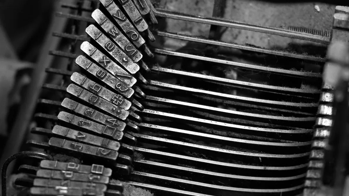
Kerning and tracking are 2 different controls
Kerning adjusts the space between exactly 2 characters. Tracking adjusts the space across a whole run of characters. They sit next to each other in the Character panel, they use the same units, and Illustrator itself tells you which one you are allowed to use: with an insertion point blinking between 2 letters the kerning field is live and the tracking field is not particularly useful, and with a range of text selected the kerning field greys out entirely.
That greying out is the single most common confusion on this subject. If the kerning field will not accept a number, you have a range selected rather than a cursor placed. Click once between the 2 letters you mean, and it comes back. The practical rule follows from the definitions: fix individual collisions with kerning, change the overall colour and fit of a line with tracking, and never try to fix 1 bad pair by tracking the whole word.
Auto, Optical and 0: choosing the kerning method
The kerning field offers 3 kinds of value, and picking the right one takes about 2 seconds once you know what each does.
Autouses the kerning pairs built into the font file by the person who designed it. A professionally produced text face ships hundreds or thousands of these pairs, covering exactly the combinations that go wrong. This is the correct default for body text, and overriding it means overruling the type designer on their own typeface.Opticalignores the font's pairs and spaces the letters by their shapes as Illustrator measures them. Use it when a face has no built in pairs, which is common in free display fonts, and when a line mixes 2 typefaces or mixes text with numerals from different sources.0switches kerning off altogether and gives you the raw side bearings of each glyph. It is almost never what you want, and it is worth recognising because a line that looks subtly wrong everywhere rather than wrong in 1 place has usually been set to 0 by accident.
Set the method first, then correct by hand, and only at display sizes. At 10 pt in a paragraph, hand kerning is invisible work that nobody will ever see. At 72 pt across the top of a poster, or in a wordmark that will be reproduced 10,000 times, every pair is worth 30 seconds. If the Type tool and the Character panel are new, Illustrator: the first hour sets up the document and opens the panels this page assumes are already in front of you.
Kerning a wordmark by keyboard, in 6 steps
Kerning a wordmark by keyboard is faster than typing values, because the eye judges the result and the hands never leave the arrow keys.
- Set the type with the
Typetool, shortcutT, at the largest size that fits your screen. Kerning judged at 12 pt and used at 200 pt will be wrong. - Open the
Characterpanel withCtrl+Tand set the kerning method toOpticalif the face is a display font, or leave it onAutofor a well made text face. - Set the keyboard step before you start: the
Typesection ofPreferencesholds aTrackingvalue that bothAltplus arrow adjustments use, and its default of 20/1000 em is coarse for fine work. Drop it to 5 or 10 for a wordmark. - Click between the first 2 letters and hold
Altwhile pressing the left arrow to close the gap or the right arrow to open it. - Work left to right through every pair once, then turn the artwork upside down with
Object > Transform > Rotateat 180 degrees and look again. Reading is what stops you seeing spacing, and removing the reading removes the blind spot. - Squint at the finished line, or zoom out to 25 percent. Even spacing looks like an even grey; a pair that is still wrong shows as a light or dark patch.
The pairs that go wrong are predictable, and 5 of them account for most of the work: AV, LT, To, Yo and any letter followed by a full stop or comma after a round or diagonal shape, such as r. or y,. The cause is geometry rather than carelessness: a diagonal or an open shape leaves a wedge of white that the font's default side bearings cannot see, because side bearings are rectangular and letters are not.
Tracking values that hold up
Tracking is set for the whole run, and 4 conventional starting points cover most work.
- Body text at 9 pt to 12 pt: leave tracking at 0 and change the typeface if the colour of the paragraph is wrong.
- Display type at 48 pt and above: a small negative value, often between -10 and -25, because type designed for reading has spacing built in for reading sizes, and that spacing looks loose when the letters get large.
- All capitals and small capitals: a positive value, commonly between +50 and +100, because capitals were never designed to sit against each other at default spacing.
- Light text on a dark background: a slightly positive value, because light shapes optically bleed into dark ground and the counters close up.
The self inflicted damage to watch for is negative tracking used to make text fit a box. Past about -50 the letters begin to touch, the word stops being read as letters and starts being read as a shape, and every viewer can see it even if they cannot name it. Resize the box, cut a word, or change to a narrower cut of the typeface instead.
What Illustrator will not do here
Three limits are worth knowing before you commit a file. Outlining type with Type > Create Outlines, shortcut Shift+Ctrl+O, converts the letters to paths, and from that moment the Character panel does nothing to them: the kerning is frozen into the artwork and further adjustment means moving each letter as an object with the Selection tool. Outline late, and always keep an editable copy of the type on a locked layer. The same habit is worth having about software as well as files: Adobe Fireworks, and what replaced it is what the large version of this looks like, a body of work whose editable form lives only inside a program that was discontinued and never given a successor.
Illustrator also has no hanging punctuation control. Optical margin alignment, which pulls quotation marks and hyphens slightly outside the text edge so the margin reads straight, is a feature of InDesign's Story panel and has no Illustrator equivalent, which is 1 of several reasons the Illustrator or InDesign decision matters as soon as a job has real text in it. And kerning does not survive a trace: lettering converted from an image by Image Trace is shapes, not type, so the fields stay greyed out no matter what you select. If you inherit outlined or traced lettering and the spacing is wrong, identify the typeface and set the words again. It is faster than nudging 11 paths, and it leaves you with something you can edit next year. The trace that flattened the lettering is a separate operation with its own settings and its own cost, described alongside the others on Illustrator, operation by operation.
Where to go next
Keep making.
All guides Still relevant
Find your flow with gradients.
Build colour transitions with control, from a simple blend to a freeform gradient.
 One click now
From pixels to paths.
Turn an image into editable vector artwork, and know when Image Trace needs help.

Your first hour in Photoshop.
Start with layers, selections and masks. Build a foundation you can keep using.