Illustrator
Gradients
CURRENT. To put a gradient on a vector object in Illustrator, select it, press G for the Gradient tool and drag across the shape: the default white to black fill appears, and the bar you dragged is the annotator that controls it from then on. The gradient tool works the way it has worked for 20 years, which is unusual on this site and worth saying plainly. What has changed is that there are now 3 gradient types rather than 2, that gradients apply to strokes as well as fills, and that 1 specific gradient recipe from the 2006 web now dates a picture the second anybody looks at it. This page covers the tool, the settings that matter, the mesh people reach for far too early, and the look to avoid.
CURRENT
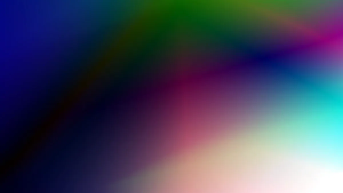
Applying and controlling a gradient, in 7 steps
Apply a gradient through the Gradient panel, because the tool sets direction on the artboard while the panel sets everything else.
- Select the object with the
Selectiontool, shortcutV. - Open
Window > Gradient, shortcutCtrl+F9, and click the gradient swatch to apply the default 2 stop white to black fill. - Press
Gand drag across the shape to set the angle and the length. HoldShiftwhile dragging to constrain the angle. - Double click a stop on the annotator or on the panel slider to set its colour, and drag stops along the slider to move them.
- Click below the slider to add a stop, and drag a stop away from the slider to delete it.
- Set
Locationas a percentage for each stop, and drag the diamond above the slider to move the midpoint between 2 stops. The midpoint is where most of the character of a gradient lives, and it is the control beginners never touch. - Type an exact figure into the
Anglefield, such as 90 degrees for a straight vertical, once the drag has got you close.
What goes wrong at step 3 is that people re-drag the tool every time they want a change, which resets the whole gradient. Once the gradient exists, drag the ends of the annotator instead: the round end moves the origin, the square end moves the far edge, and the small rotation handle just outside the square end changes the angle without changing anything else.
Linear, radial and freeform, and which one a job needs
Linear, radial and freeform are the 3 gradient types, and they are selected from the Type control at the top of the Gradient panel.
- Linear runs colour along a straight axis. Use it for backgrounds, for a sky, and for anything where the light has 1 direction.
- Radial runs colour out from a centre point. Set
Aspect Ratiobelow 100 percent to squash the circle into an ellipse, which is how a radial gradient stops looking like a bullseye and starts looking like a lit surface. - Freeform drops colour points anywhere inside the shape, in either
Pointsmode orLinesmode, with aSpreadslider controlling how far each point reaches. It is the newest of the 3, so any tutorial that offers you only linear and radial was written before it shipped.
Freeform is the answer to about half of the situations where people previously reached for a gradient mesh. Drag 4 or 5 colour points onto the shape, adjust the spread, and you have a soft multi directional blend that stays a normal path with a normal fill, which means it can still be recoloured, reshaped and reused. That is not true of a mesh.
Gradients on strokes, and fading to transparent
Gradients on strokes are controlled by 3 buttons in the Gradient panel, which appear once the stroke rather than the fill has focus. Press X to move focus between fill and stroke first, or the buttons stay inactive and the gradient keeps landing on the fill.
- Within stroke: the gradient runs across the stroke as though the stroke were a thin shape.
- Along stroke: the gradient follows the direction the path was drawn in, which is how a line fades out at one end.
- Across stroke: the gradient runs from one edge of the stroke to the other, which gives a piped or tubular edge.
Fading to transparent is the other question people get wrong, and the fix is 1 field. Each gradient stop carries its own Opacity value in the Gradient panel, so a fade to nothing is a stop at 0 percent opacity, not a white stop. A white stop looks identical on a white artboard and then prints as a white block the moment the artwork is placed on anything else. Check by pressing Shift+Ctrl+D to show the transparency grid, which makes the difference obvious immediately. It is the vector version of the distinction that runs through Removing a background in Photoshop, where a pixel hidden by a mask and a pixel deleted outright look identical until the artwork is moved onto something that is not white.
The gradient mesh, and why it is reached for too early
A gradient mesh is a grid of colour points laid over a shape, created with Object > Create Gradient Mesh or by clicking on a shape with the Mesh tool, shortcut U. The dialog asks for Rows and Columns, an Appearance of Flat, To Center or To Edge, and a Highlight percentage. It is the most capable colour tool in Illustrator and the one that costs the most to use, for 3 reasons worth knowing before you start.
The conversion is one way. Once a path becomes a mesh object, the plain path is gone, and undo is the only route back. The mesh cannot be recoloured with a single swatch afterwards, because there is no longer 1 fill to change, and every mesh point holds its own colour. And it does not export everywhere: .svg carries linear and radial gradients natively and has no mesh at all, so a mesh object is rasterised or approximated on the way out, which is the wrong outcome for anything destined for a web page.
Try 3 cheaper things first. Try a freeform gradient. Try stacking 2 objects with a gradient at partial opacity on the upper one. Try the Blend tool, shortcut W, with Object > Blend > Blend Options set to Specified Steps, which gives a controlled falloff along any shape you like. Reach for the mesh when the job is photographic realism in vector, which is the 1 case where nothing else does it. All 3 of the cheaper routes leave the object a path, and that is the test Illustrator, operation by operation applies to each tool in turn: what does this leave you able to change next year.
The gradient that dates a picture
DATES THE PICTURE: the glossy web button of about 2006, which is a rounded rectangle with a linear gradient from a saturated colour to a darker version of itself, plus a white to transparent gradient over the top half only, plus a 1 px light stroke and a drop shadow underneath. Anyone who was working then recognises the recipe instantly, and the giveaway is the second gradient: the hard horizontal line halfway down the shape where the highlight stops. The related tells are chrome lettering built from 6 or more stops of grey with a hard band in the middle, and a black to white linear gradient applied at 90 degrees to every background in the file.
The gradient tool is not the problem, and none of this is an argument for flat colour. The dated part is the specific stack: strong gradient, plus bevel, plus inner highlight, plus shadow, all on 1 small object. Contemporary work uses gradients that are wider than the object, closer in value between the 2 stops, and usually off axis rather than straight up and down. If you want to check your own file, hide the effects for a moment: a gradient that only reads as depth once a bevel and a shadow are stacked on top of it is doing none of the work itself. Chrome lettering carries a second cost besides the look, and it outlives the fashion: it is nearly always built on outlined type, outlining is one way, and once the letters are paths the controls described in Kerning and tracking have nothing left to act on.
Banding, resolution and what survives output
Banding is the one technical failure gradients still produce, and it shows as visible steps across a long, subtle blend, most often in a printed background or a large flat sky. Three things reduce it. Widen the difference between the 2 stops, because a gradient across 4 percent of tonal range has almost no values to work with. Add a small amount of grain from the Photoshop derived half of the Effect menu, under Texture > Grain, which breaks the steps up. And check Effect > Document Raster Effects Settings before output, because any raster effect you add renders at the resolution set there, and 72 ppi in a document going to print is the reason a gradient with grain arrives soft. If the same background has to sit behind 12 pages rather than 1, the raster setting is the smaller of your problems: a document that long stopped being an Illustrator job somewhere around page 2, which is the Illustrator or InDesign decision.
Where to go next
Keep making.
All guides One click now
From pixels to paths.
Turn an image into editable vector artwork, and know when Image Trace needs help.

Your first hour in Photoshop.
Start with layers, selections and masks. Build a foundation you can keep using.
Your first hour in Illustrator.
Get comfortable with paths, anchor points and a different way of drawing.